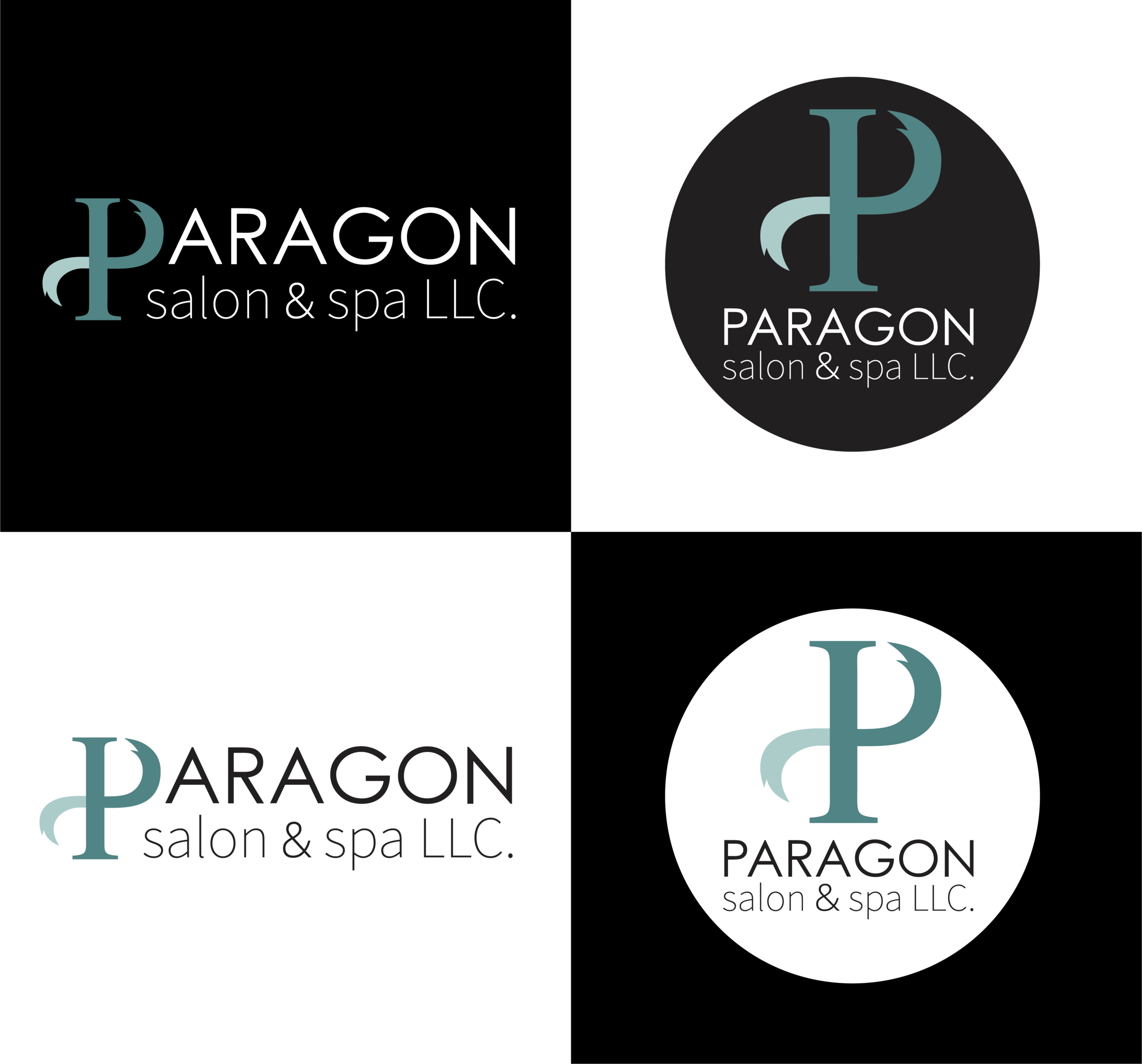
SPRING 2019| (FREELANCE) PARAGON SALON LOGO
In Spring 2019, I was hired by the owner of Paragon Salon & Spa LLC. to design a logo to coincide with the opening of their business. She provided a color scheme and a prompt to create something warm, welcoming, relaxing, clean, legible, unisex, and relevant yet unpretentious.
I started off brainstorming potential concepts in a Procreate document. I settled on one that was simple yet eye-catching, which included a typographic “P” resembling a lock of hair. I created a polished vector image, placed it into a solid-colored circle for a modern edge, and then set to work experimenting with font pairings. I sent over a first draft for edits and the owner loved it but requested I also make a horizontal version for use on signage and business cards. I sent her a mockup of potential horizontal compositions and we were able to find the perfect fit for her business! I made sure to provide her with several variations of both the circular and horizontal logo, including transparent and solid colored backgrounds in black and white. I sent .PNG as well as Adobe Illustrator files, and let the owner know what fair-use fonts had been used along with links to download them.